Coronavirus Outbreak; I'm an ER doctor. Please take coronavirus seriously. - Politics Forum.org | PoFo

Wandering the information superhighway, he came upon the last refuge of civilization, PoFo, the only forum on the internet ...

All general discussion about politics that doesn't belong in any of the other forums.

Moderator: PoFo Political Circus Mods

#15077038
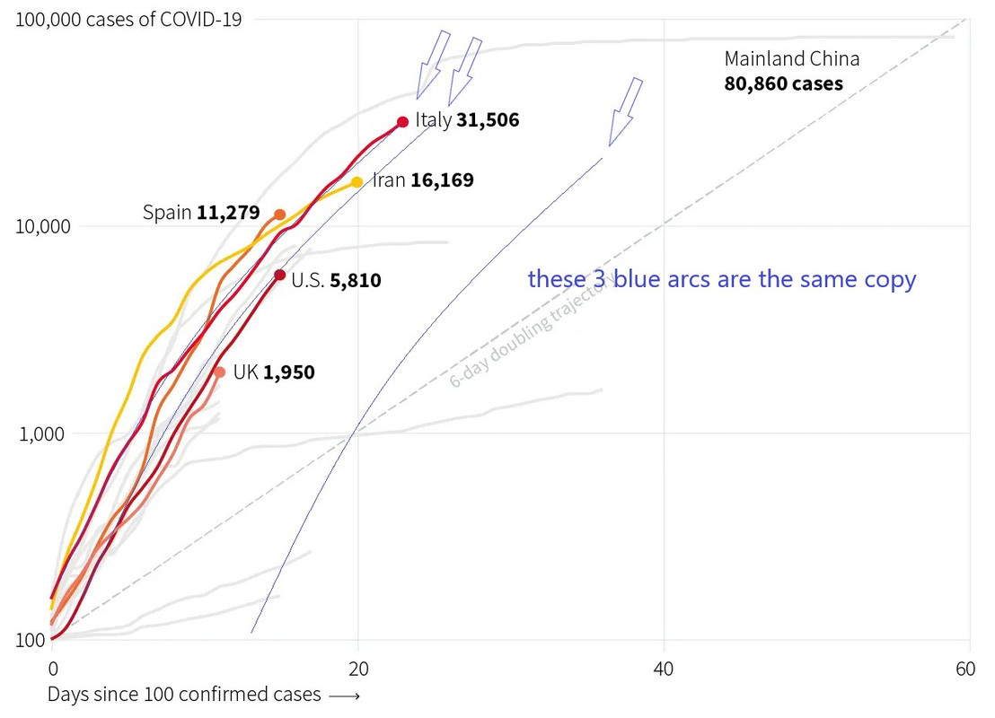
The graph on this linked article is misleading. It is on log paper. So, a straight line is really exponential growth.
You will see that many\all nations are all following the same path. And the doubling time is less than 6 days (the faint dashed line they drew for us sloping up to the right). Maybe 2 or 3 days.
Note that I think they all start from when that nation reached 100 cases of cronavirus.
Also, China has won and stopped the exponential growth. There is no evidence yet that other nation will do the same at the same relative time. We shall see in just a few days.

Opinion, Coronavirus Outbreak
I'm an ER doctor. Please take coronavirus seriously.
Most people don’t understand exponential growth. If they did, they’d be far more frightened.

Coronavirus – latest updates
See all our coronavirus coverage
by Clayton Dalton
on Fri 20 Mar 2020 10.15 GMT Last modified on Fri 20 Mar 2020 12.27 GMT


https://www.theguardian.com/commentisfr ... ial-growth
#15077076
On social media, I'm seeing a lot of people saying that the US on the same curve as Italy. I don't see how you can make that claim. This is just bullshit people are saying.

Two reasons:
1 - We really don't know how many people are infect due to lack of testing.
1a - To make a fair comparison, we would need to also understand to what degree Italy is testing, to make sure we are doing apples to apples.
2 - The graph in the link clearly shows we are not on the same curve as Italy. We are closer to the UK (and although not shown, France).

As of right now, anyone that say's "we are like Italy" is simply full of shit. That's totally speculative, basically. Further, the US is younger than Italy so we will see a lower death rate. Also the US has a higher population than Italy, so on a per capita basis, the US has far fewer infections than Italy has.

The misuse and misinterpretation of data is rampant right now with this virus.

To be clear:
I'm not saying the US isn't on the same curve as Italy (we could be), what I am saying is that there is no data to support that claim at this point in time so for the time being, people shouldn't say that.
#15077148
Steve_American wrote:Also, China has won and stopped the exponential growth. There is no evidence yet that other nation will do the same at the same relative time. We shall see in just a few days.

That is what they are reporting. Either it is true, or it is not true. There is no evidence yet that China has stopped the coronavirus. We just have reports from them that this is the case. They have also kicked out reporters from the Washington Post, New York Times and Wall Street Journal--suggesting that these news outlets may not corroborate the claims of the CCP.

That was on 11 March. I can’t imagine what it’s been like for the physicians and scientists who have been warning of a pandemic like this one for decades.

I've said as much myself. We've been long overdue for a black swan event like this one. I also noted that we were ill prepared for it.

But naysayers and doubters are still, incredibly, refusing to listen to the nearly unanimous voice of the nation’s health and medical authorities, who are pleading for everything to be canceled or closed that can be, and urging aggressive social distancing to limit the virus’s spread.

This is what happens when you run global warming propaganda for decades on end and your predictions are universally wrong; more specifically, scientists who prostitute themselves for political agendas (e.g., global warming) or corporate agendas (e.g., cigarette companies) destroy the reputation of science.

Fox News has had an outsized role in spreading misinformation, with anchors and guests saying that “now is actually the safest time to fly”, arguing that people are “overreacting” to the virus, and suggesting that the virus is an “impeachment scam”.

It's safer from an epidemiological perspective on uncrowded planes than on full planes. As for suggesting it was just another "impeachment scam", again when politicians lie to the public 24/7 about Trump being a Russian asset and so forth, it diminishes the credibility of the government. People do not trust the DoJ, the FBI, the CIA, or the NSA anymore. People having a nonplussed reaction should be viewed in the context of the degree of propaganda thrown at them on a daily basis. Trump had already banned travel from China while Washington was obsessed with impeaching Trump on charges that everyone knew was contrived and baseless from the outset.

Why is it so difficult for us to appreciate the scale of what an unchecked global pandemic could do? The answer may have something to do with how difficult it is to intuitively understand abstract concepts like exponential growth.

Not for computer heads. We deal with exponential math all day long, because that's how computers work. Rather, people care about the people in their families, their circle of friends, and their community. They disregard what happens to others.

This difficulty has been appreciated since at least 1256, when an Islamic scholar recorded what is known as the wheat and chessboard problem.

So obviously, Clayton Dalton is wrong in his speculation.

It’s a major reason why people don’t take their retirement accounts seriously enough, for one.

Cut the capital gains tax to 0 for amounts around the average wage and give people a tax rebate for the effect of inflation on their savings, and it will be universally understood. The power of compound interest doesn't work the way it's explained because of inflation and capital gains tax.

Rancid wrote:1a - To make a fair comparison, we would need to also understand to what degree Italy is testing, to make sure we are doing apples to apples.

Regrettably, that leaves us with deaths as the most reliable statistic.

Rancid wrote:Further, the US is younger than Italy so we will see a lower death rate. Also the US has a higher population than Italy, so on a per capita basis, the US has far fewer infections than Italy has.

The US has lower population density, except in the major cities on smaller geographic footprints like New York and San Francisco.
#15077154
blackjack21 wrote:Regrettably, that leaves us with deaths as the most reliable statistic.

Agreed, which is something I've said many times in other threads. To really understand if this virus is deadly, we should see an uptick in respiratory illness deaths compared to when before this virus started to spread in the US.

Right now I've not seen anyone do this analysis to really properly compare the US to Italy. Which again, means it would be incorrect to make the claim that the US is tracking Italy. Additionally, everything I've seen say's we not tracking Italy, but instead looking more like France and the UK.

blackjack21 wrote:The US has lower population density, except in the major cities on smaller geographic footprints like New York and San Francisco.


Indeed, so again, it would be foolish to blanketly say that US is tracking like Italy. Unless there's some serious analysis done on the numbers/data, which the people making this claim never produce.
#15077282
Rancid wrote:On social media, I'm seeing a lot of people saying that the US on the same curve as Italy. I don't see how you can make that claim. This is just bullshit people are saying.

Two reasons:
1 - We really don't know how many people are infect due to lack of testing.
1a - To make a fair comparison, we would need to also understand to what degree Italy is testing, to make sure we are doing apples to apples.
2 - The graph in the link clearly shows we are not on the same curve as Italy. We are closer to the UK (and although not shown, France).

As of right now, anyone that say's "we are like Italy" is simply full of shit. That's totally speculative, basically. Further, the US is younger than Italy so we will see a lower death rate. Also the US has a higher population than Italy, so on a per capita basis, the US has far fewer infections than Italy has.

The misuse and misinterpretation of data is rampant right now with this virus.

To be clear:
I'm not saying the US isn't on the same curve as Italy (we could be), what I am saying is that there is no data to support that claim at this point in time so for the time being, people shouldn't say that.

Clearly Sir, you don't know how to read a graph.
All the nation were started when the reached 100 cases.
For the US that started right at 100 cases, but for Italy is started at maybe 150 cases (it is hard to read the numbers on log paper).
Italy starts above the US and stay above the US moving very parallel to the line for the US.
They seem VERY similar to me.**

And, yes, the graph is of "cases of coronavirus vs time", and that number depends on how much testing was done. It is therefore limited by the accuracy of the data.

.** . In fact, this similarity is scary. It shows that all efforts to flatten the curve did not change the curve all that much. Italy had the same curve as all the other nations.
#15077413
Preface:
All in all, comparing us to Italy is useless.
As of right now, there isn't enough data to know if we are on the same curve. We could very well be, but there isn't enough data to conclude that yet. Thus, no one could be claiming we are on the same curve as Italy, especially when you look at infections on a per capita basis.

Steve_American wrote:Clearly Sir, you don't know how to read a graph.

No, for the US and Italy graphs to be "on the same curve", the curves must overlap, which they are not overlapping.

Let me explain further:
The x-axis is the time in days from 100 cases. That is, the curve for each country is normalized in time (i.e. remove delays) to the point where 100 cases occured. This is done so that its easier to make relative comparisons between countries. Doing this way means you can directly compare the curves to each other. You don't have to consider how many days ahead or behind any one country is to another. That's taken care of by normalizing time=0 for each individual curve to the day 100 cases were hit. Doing it like this, makes it way easier to compare. All you have to do is look at the curves and see if they overlap. If they overlap, they are the same curve, if they don't, they are not.

In this graph, the US and Italy do not overlapping, therefore you cannot say (based on his graph) that the US and Italy are on the same curve.

Steve_American wrote:Italy starts above the US and stay above the US moving very parallel to the line for the US.

You said it right here. They are parallel, not overlapping, that means they are not the same. For them to be the same, they have to be right on top of each other. That's why the graph is done in this say, to make that direct comparison easier to do. Time has been normalized so that you don't have to consider how many days ahead or behind any country is to any other country.

Steve_American wrote:They seem VERY similar to me.**


They are similar in shape, but they are NOT the same curve. A similar shape does not mean they are the same curve. Let me demonstrate with the equation of a straight line.

Generic line equation:
y = mx+b

line 1:
y = 2x+1

line 2:
y = 2x+2

Line1 and line 2 are parallel, but not equal. Does 2x+1 equal 2x+2? No, of fucking course not. For example, if I set x = 3, line 1 is 7, and line 2 is 8. Does 8 equal 7? No, of course not.

Again, most people on this planet simply do not know how to do math/statistics properly. Every few weeks, I find myself having to school people on basic math on pofo. Not just with respect to this virus, but in other topics too.


What really matters is this:

1 - What is the US's maximum number of cases that can all be dealt with at any given moment (the health system "break point")
a. Since the US is a large country, each city/region/state will have it's own break point number
b. Perhaps if we mobilize the military, we could better manage that by load balancing patients around the country from hot regions to colder regions.

Then we do everything we can to stay below that number, whatever that number is.

All in all, comparing us to Italy is useless.
#15077514
Rancid wrote:Let me explain further:
The x-axis is the time in days from 100 cases.

Its not. Article claims it, but it obviously isn't in the graph. If they started it at case #100 or some other specific number (rather than the day it was recorded) the difference in curves would be easier to spot.

Some quick Paint3D gives me this:
Image
Those large gaps between my best fit curve and actual cases might be variation, or maybe modeling it as a power curve should be taken for what it is - a model. Better than a straight line model, but (IMO) still a low accuracy model with limited predictive ability due to it being a crude model.
#15077520
Thunderhawk wrote:Its not. Article claims it, but it obviously isn't in the graph. If they started it at case #100 or some other specific number (rather than the day it was recorded) the difference in curves would be easier to spot.

How would they be able to pin point a day for case #100, as opposed to using the day it was recorded? Presumably, there should be a small time gap between case 100 getting detected and it getting officially recorded? Seems like you have no choice but to just go with when ti was recorded, no? Also, I'm not following how the graphs do not start at case 100 for each individual country? On the face of it, it looks more or less right. For example, the Italy curve is the longest because they hit case 100 well before the US or UK.

Separate and unrelated thought:
I'm wondering if we should give serious thought to changing the school year, such that the summer break becomes a winter break. People are saying we're likely going to go through waves of school cancellations. If it's as bad as they say, then school is basically canceled for this year, and we'd probably only have 1-2 months (August-Sept) of school before the virus kicks back on in Oct. This cannot be good, especially for poor kids. Doing breaks in the winter might help us get a longer and uninterrupted school year for kids.
#15077542
The graph, to me, looks like Italy day #0 started at ~130 cases while the USA stared at 100 cases. When I made that best fit arc, I did it for Italy and copied it over onto America at the same level. The third arc is just pasted in the middle of white space, no attention to position. Anyone can try their hand using Paint3D.

Regarding the model: Im aware that the better model for disease outbreaks is an S-curve with exponential like growth at the beginning, inflection point (seems like a steady state for a while), and then exponential decay (where its arcing down). Care/treatment facilities flaten that s-curve too. Quarantines, distancing, medications, the varied level of active care and breaches of quarantines & distancing cause juts in the line of infected/dead. These juts are not just discontinuities, they break the "s-curve" model and usually do so in our favour.
#15077573
That was on 11 March. I can’t imagine what it’s been like for the physicians and scientists who have been warning of a pandemic like this one for decades.


Go back and read my posts on this for about 10 years now.

Regarding population density in the US>

Some epidemiologists say that this is an advantage because it will slow the spread of the disease. I do not believe this for several reasons. Even in the most rural of areas there is still considerable contact between people. What does not work as well in these areas is communication and the supply chain.

The disease might be harder to fight in rural areas because a significant part of America has substandard health care already. Rural hospitals may be a blessing or a curse. One thing is certain. Their resources are already spread quite thin particularly with regards to intensive care facilities. Many rural hospitals rely on transfer for their most ill patients. Consider the phenomena of regional trauma centers and the increasing specialization of hospitals in general.

Large urban hospitals not only have the services of a considerable house staff but also the welcome augmentation of doctors in training, medical and nursing students, and the access to a wide variety of specialists.

Here is a statistic I want you all to chew on. Set your mind to CV-19 and ponder on this (Rancid). 73% of pulmonologists (lung specialists) perhaps the most critical people in fighting this infection, are over the age of 55.
Sleep well.
#15077610
United States
Coronavirus Cases:
35,070

Deaths:
458

Recovered:
178


https://www.worldometers.info/coronavirus/country/us/

Italy:
Coronavirus Cases:
59,138
Deaths:
5,476
Recovered:
7,024

https://www.worldometers.info/coronavirus/country/Italy

Let's hope it doesn't get as bad as Italy, because the USA is on a pace to really have a lot more cases.
Russia-Ukraine War 2022

@late If you enter a country, without permission[…]

My prediction of 100-200K dead is still on track. […]

When the guy is selling old, debunked, Russian pro[…]

There is, or at least used to be, a Royalist Part[…]